📊 Your workspace, at a glance
Web & Mobile
In this release we’re giving admins and managers something they’ve been asking for: a real-time view of what’s happening in their Polser workspace. No more guessing. No more exporting data. Just open the dashboard and know.
The dashboard
Your workspace now has a dashboard packed with useful insights and analytics.
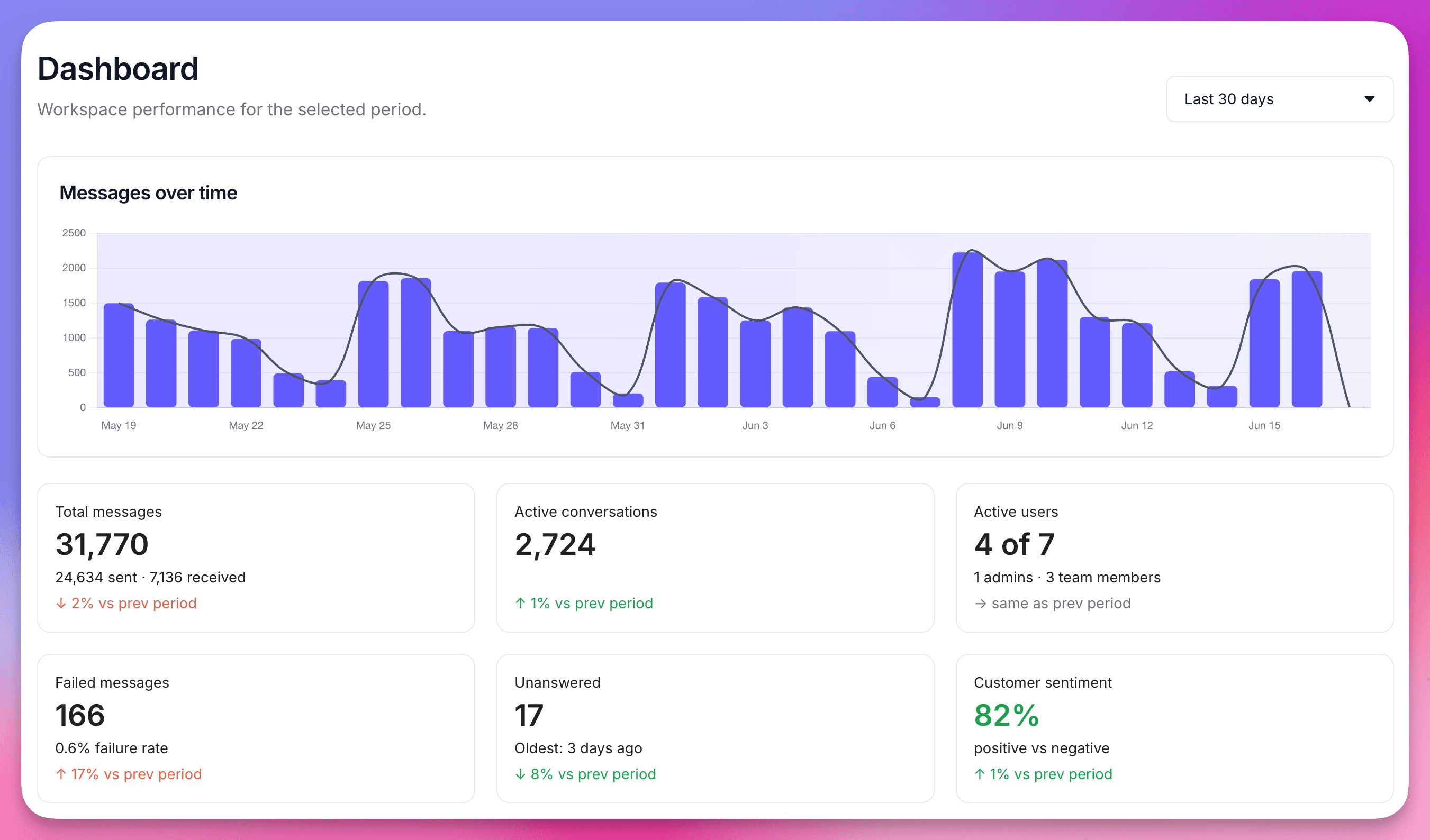
It’s designed for the people who need the full picture: admins and managers who want to know how the team is performing, whether messages are getting through, and where things need attention. This first version covers two areas.
Main Metrics gives you a six-card snapshot of the period you select: total messages, active conversations, active users, failed messages, unanswered conversations, and customer sentiment. Each card shows how you’re trending against the previous equivalent period, so you always know whether things are moving in the right direction.
Message Deliverability shows you exactly what happened to every outbound message you sent. A visual flow takes you from sent to delivered to read, and makes it immediately clear where messages dropped off. Below it, a failure breakdown shows the reasons behind every failed message, and a country-level table surfaces where failure rates are highest.
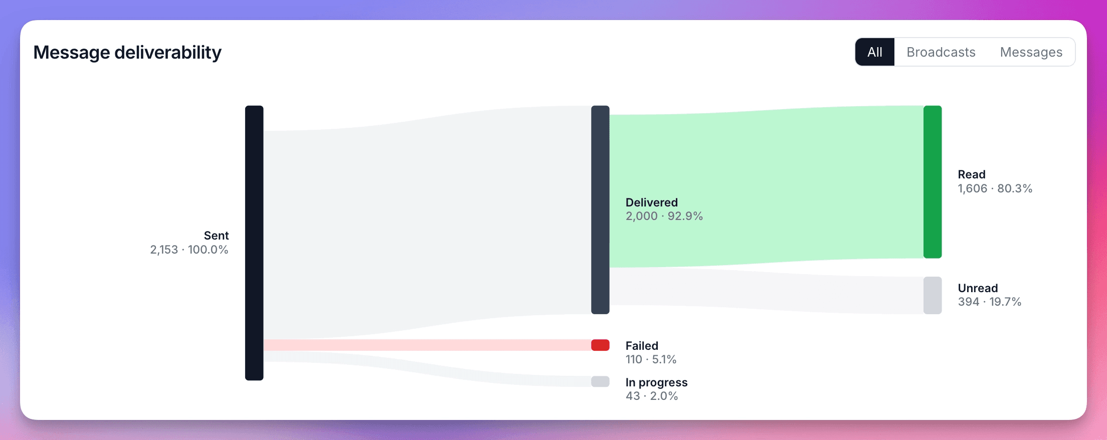
You can filter the entire deliverability section by All messages, Broadcasts, or Regular messages. The dashboard is available to admin and manager roles. Select your date range in the top right: yesterday, last 7 days, or last 30 days.
👷 Coming up next
The dashboard is just getting started. Features Usage, Team & Collaboration, Integrations, and AI sections are already in design and will follow in the coming months.
We are WhatsApp specialists!

Polser
Why don't we continue this conversation there?